The Mapmakers Who Made the 20th Centuryby Eliane Dotson
This month we focus on mapmaking in the 20th century, during which the world experienced more innovation and transformation than any other period in history. Likewise the field of cartography underwent major changes. Mapmaking, which in the 19th century was characterized by utilitarian maps used to expand geographical knowledge, shifted in the 20th century to include artistic tools used for marketing and propaganda. Those responsible for making maps also changed; as the centuries of mapmaking progressed, individual cartographers were replaced by either large map publishing firms or artists and illustrators commissioned to create specific maps. As a result, any attempt to consolidate 20th century mapmaking to a few key players becomes a challenge. Within the collectible map market, however, there are a few mapmakers who are generally regarded as having had greater influence on the evolution of maps, and their work remains some of the most desirable on the market. In this article we review three of the most important and collectible mapmakers, as well as one genre of maps symbolic of the 20th century that cannot simply be narrowed down to one individual mapmaker. (Click on any image below to access a high resolution version of the image.)
Rand McNally & Company (1868-)
Although the Rand McNally partnership was originally formed in 1868, its roots began in Chicago in 1858 in William H. Rand's printing office, in which Andrew McNally was employed as a printer. The company gained access to the burgeoning railway business by printing tickets and timetables, and in 1871 expanded into publishing with a monthly Rand McNally Railway Guide. The following year Rand McNally opened a map department to provide content for the popular guides. Their map business grew to become "the dominant commercial map publisher of the early 20th century" (Manasek et al. 294). Rand McNally's rapid growth and success was partly due to the company's early adoption of wax engraving, which reduced the cost to produce maps and simplified the process of making corrections. As a result, they were able to produce the most up-to-date maps available to the increasing number of travelers, settlers and emigrants in the United States.
As transportation in the 20th century evolved from trains to automobiles and airplanes, Rand McNally filled the need in the market for accurate maps. The popularity and reliability of their maps influenced commercial competitors and government agencies alike. In 1917, the company began publishing Auto Trails maps, which featured a system of numbered highways invented by one of its cartographers, John Brink. (Although some contend that this system had already been invented by the Wisconsin Highway Commission the year prior, Rand McNally was the first to publish maps using the system.) In order to ensure the reliability of using this numbered roadway system for traveling, Rand McNally actually erected many of the corresponding highway signs on roadways. This numbering system was later adopted by both state and federal highway authorities.
The mapping industry lagged in developing aeronautical charts, so as commercial aviation "took off" in the 1910s and 1920s, pilots had to rely on railroad maps and coastal navigation charts on which they annotated their own navigational knowledge. While the US government focused on military aviation maps, Rand McNally served the commercial aviation market using data collected by the U.S. Army Air Service. The company published its first aviation map of the United States in 1923 based on its road and railroad maps, adding information on landing fields. Beginning in 1929, Rand McNally published a series of Air Trail State Maps, and although the maps featured limited aeronautical data, they were ordered in bulk by the Army Air Corps and distributed to their pilots.
For nearly 150 years, the Rand McNally Company has been publishing wall maps, atlases, pocket maps, aeronautical charts, and guidebooks. The company is still in operation today headquartered in Chicago, and continues to publish its #1-selling road atlas.
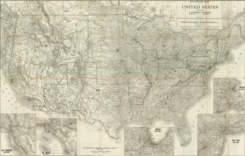
Aviation Map of United States Featuring Landing Fields (1923)
This rare, early aviation map of the United States is the first edition, published in April 1923. Green overprinting is used to locate over 3,000 landing fields and airports. The US is divided into nine districts as indicated in Roman Numerals, but there is no explanation of these regions. Five large inset maps illustrate major cities: San Francisco, Los Angeles, Chicago, New York, and Boston. The map was created by the United States Touring Information Bureau, Waterloo, Iowa with the cooperation of the Airway Section of the United States Army Air Service and the Aeronautical Chamber of Commerce of America.
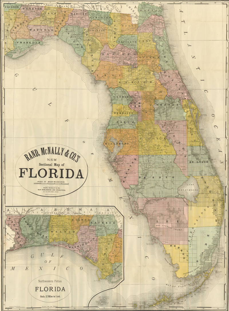
Rand, McNally & Co.'s New Sectional Map of Florida (1910)
This large pocket map with incredible detail throughout is on a scale of 12 miles to the inch. The map locates counties, townships, towns, roads, and railroads as well as watershed, swamps and coastal detail. The large inset shows the "Northwest Portion of Florida" drawn on the same scale. Originally drawn in 1898 this is the new edition of 1910.
MacDonald Gill (1884-1947)
MacDonald ("Max") Gill was raised in several seaside cities in East Sussex and West Sussex as one of 13 children of Arthur Gill, a minister, and Cecily Rose, a former singer. An amateur artist himself, Arthur Gill encouraged his children to draw and paint, and Max became passionate about art, filling sketchbooks and entering art competitions in boys' magazines. Max also had a quirky sense of humor, indulging in puns, storytelling, and playing practical jokes on family members. At the age of 18 Max followed his older brother, Eric, to London and began working as an assistant to church architects. Both brothers enrolled in architecture and writing classes, and became close friends with famed calligrapher and typographer Edward Johnston, a member of the Arts and Crafts movement who would influence both their careers. Max's brother, Eric, became a prominent figure in the Arts and Crafts movement, and was best known as a sculptor and type designer, creating the Gill Sans sans-serif typeface.
In 1913, Max was commissioned by the Underground Electric Railways Company to design a map of London that promoted both the interconnected Underground railway system and tourism in the city. Conceived by Frank Pick, head of marketing for the Underground, the idea was to encourage Londoners to visit the sites of their city, thereby increasing usage of the railways during off-peak hours and improving overall passenger numbers. Max and Frank shared "a belief in the social importance of integrating superior design in the manufacture of commercial goods" (Burdon 9-10). Max created a map that was novel in both design and message, with bold primary colors, a mixture of medieval and modern elements, and humorous text bubbles. The result, popularly known as the Wonderground Map, is often credited as "the most influential of all twentieth-century pictorial maps" (Hornsby 11) and was copied by other artists in city maps of Boston, Manhattan, Melbourne, Mexico City, and Paris, to name a few.
Max Gill was commissioned to create numerous other maps, including a total of seven for the Underground railway between 1913-32, a Highways of Empire map (1927) for the Empire Marketing Board, and The Time & Tide Map of the Atlantic Charter (1942) for the Ministry of Information. His works remain highly prized for their aesthetic beauty, intricacy, and imagination.
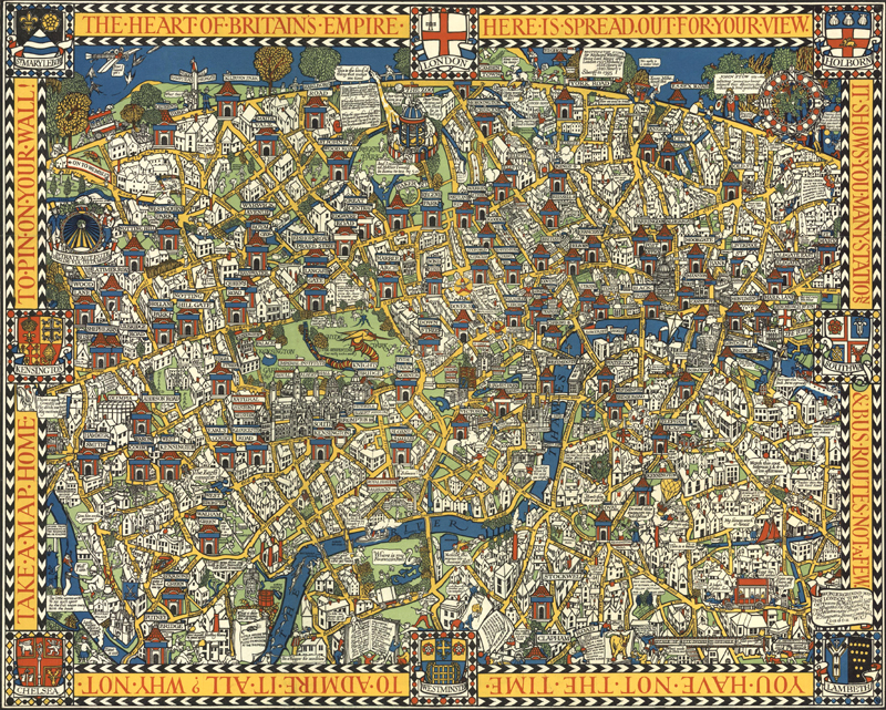
The Famous Wonderground Map of London Town (1927)
The key to Gill's popular map of the London Underground is his melding of both new and old imagery, bold colors, whimsical figures, and humorous text. Some of the "old" components include the underground stations, which are illustrated as turreted buildings, and the ancient coats of arms within the map border. These contrast with the modern elements, such as the overall Art Deco style and cartoonish figures. Gill's unusual use of a vibrant yellow color for the roads was replicated on many other city plans in the 1920s and 1930s, as was his use of an orthographic projection and his depiction of buildings in profile. The poster-sized map was first displayed in Tube stations in 1913, and the following year became available in a slightly reduced size for purchase by Londoners and tourists alike. (Image courtesy of David Rumsey Map Collection)
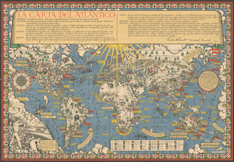
La Carta del Atlantico (1943)
This Art-Deco inspired map by Gill was originally commissioned to commemorate the Atlantic Charter and to help boost British morale during World War II. This example is a rare Spanish-language edition that was published a year after the original English edition. The full text of the Atlantic Charter is inscribed on a scroll across the top of the map, along with Roosevelt and Churchill's signatures. The Charter radiates rays of hope over the world and the eight Articles of the Charter are illustrated within the map. As an example, the fourth Article of the Charter focuses on natural resources and global trade, and an extensive legend identifies the symbols for various raw materials found on each continent. Additionally, ships and shipping lanes fill the oceans to demonstrate the ease of developing global trade.
Jo Mora (1876-1947)
Joseph ("Jo") Jacinto Mora was born in Uruguay in 1876 and moved the following year with his family to the eastern United States. He showed an early aptitude for the arts and began illustrating for newspapers and children's books in his twenties. Mora was fascinated with the American West, and after working on cattle ranches in Texas and Mexico as a young adult, he moved permanently out west in 1903. He spent his time learning about old Spanish vaqueros, American cowboys, and the Hopi and Navajo tribes, subjects which became lifelong passions and the focus of much of his work. His paintings and photographs of the Hopi were memorialized into a traveling exhibit for the Smithsonian Institution in 1979.
Mora was an artist with many talents, including drawing, painting, illustration, sculpture, photography, writing, and mapmaking. His artistic skills were perhaps unsurprising, as his father was a noted sculptor, and Jo Mora on occasion helped his father on sculpting commissions, including the facade of the Native Sons of the Golden West Building in San Francisco. His foray into mapmaking began later in his career while he was residing in Pebble Beach, California, where he would spend the last 27 years of his life. Mora's first map was of the Monterey peninsula, entitled California's Playground, and was commissioned by the Del Monte Hotel to commemorate the hotel's grand reopening in 1926. The map combined historical facts with whimsical illustrations, cartographic points of interest, cartoonish figures, and witty notations. And thus was born Mora's unique style that is common on all of his "cartes," a term that he used for his cartographic works. Although Mora only created about a dozen maps in his career, Stephen J. Hornsby contends that "His maps formed the most important collection of pictorial cartography done by any artist of one particular region of the United States" (Hornsby 29).
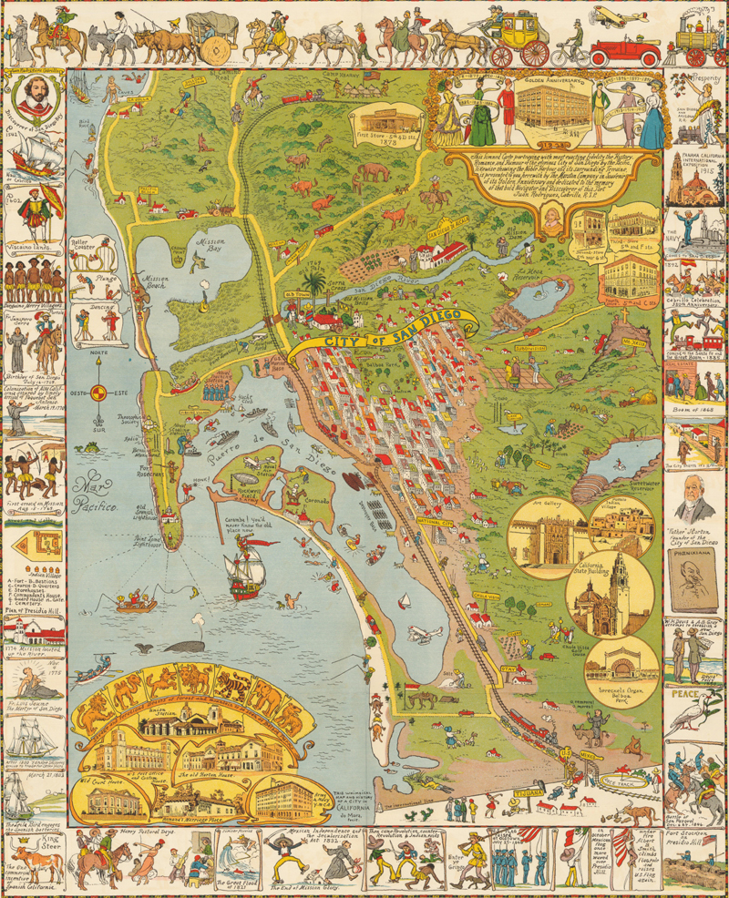
City of San Diego (1928)
This pictorial map of San Diego is filled with scores of cartoon-like illustrations showing locations of towns, natural formations, tourist attractions, local culture, products and animals. The paneled border contains 33 different pictures all with multiple figures such as "Enter ye Gringo" showing a Daniel Boone-like figure dressed in buckskins, "The Navy Comes to San Diego." Mora's humor can be seen in several scenes including locating the caves at La Jolla with a caveman. The elevations of six important buildings including Union Station appear at lower left. The map was issued to commemorate the Golden Anniversary of Marston's Department Store and portrays the city "with the most exacting fidelity the History, Romance, and Humour of the glorious City of San Diego by the Pacific," which ends with a tribute to the port's discoverer "Juan Rodriquez Cabrillo, RIP."
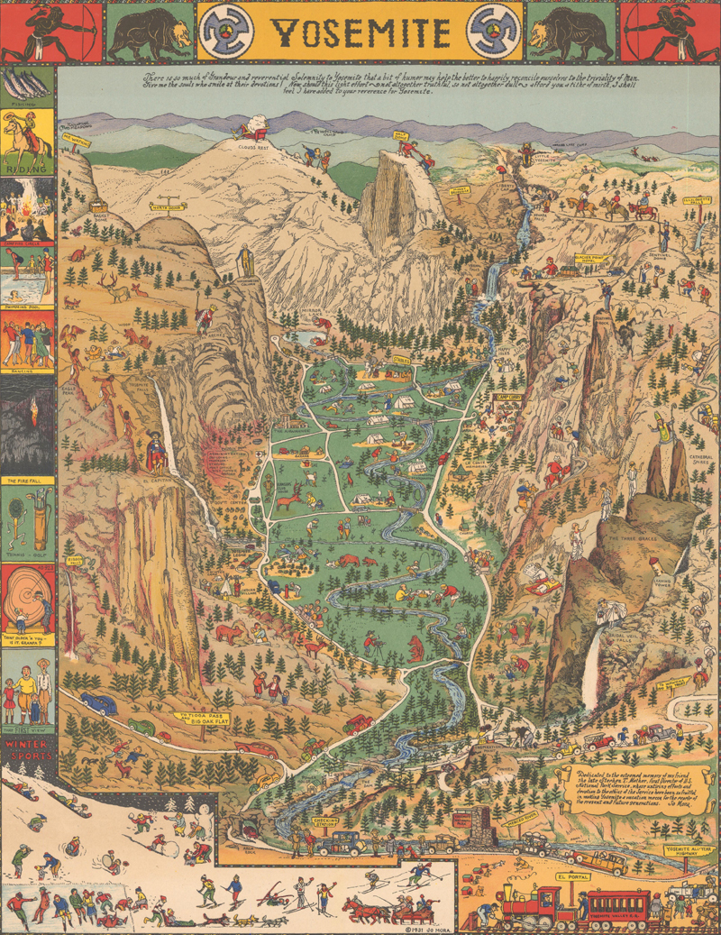
Yosemite (1931)
Dedicated to Mora's friend Stephen Mather, the industrialist and conservationist who became the first director of the National Park Service (an organization he rallied to create), this map depicts the majestic sweep of Yosemite National Park and is filled with light-hearted illustrations and visual puns. Perhaps the note beneath the title best sums up Mora's project: "There is so much of Grandeur and reverential Solemnity to Yosemite that a bit of humor may help the better to happily reconcile ourselves to the triviality of Man. Give me the souls who smile at their devotions! Now, should this light effort -- not altogether truthful, so not altogether dull -- afford you a tithe of mirth, I shall feel I have added to your reverence for Yosemite." Among the puns are a king atop Royal Arches, a picnic basket on Basket Dome, and a man relaxing in a chair, engulfed by a cloud on Cloud's Rest. The title is done in a style that emulates the Native American art for which Mora had such an appreciation.
Propaganda War Maps (1914-1945)
While an enormous output of government-produced maps of the land, sea and air were generated during the two world wars, the most fascinating and collectible maps from this time period are propaganda war maps. Although there isn't one individual mapmaker of propaganda that stands above all the rest, this genre of maps was hugely important during the 20th century and deserves discussion. Political war maps certainly didn't originate in the 1900s, but the creation and production of these maps became particularly prolific during World War I and II. One reason for the explosion of these maps was the need for governments to gain the support of their countrymen to aid in the war efforts. And gaining support wasn't as straightforward as in previous centuries due to the "multitude of different and often contradictory information sources" (Curtis & Pederson xix) to which the average person had access. In order for war to be successfully waged, the government had to maintain the approval of its people and the morale of its soldiers.
A key aspect of this genre in the 20th century is the use of pictorial imagery coupled with satire and humor. Geography simply became the backdrop on which a political message was conveyed. Oftentimes political leaders were caricaturized and nations were given symbolic identities based on popular stereotypes, which made the geographical map more accessible to the common man. The nationalistic sentiment and often tongue-in-cheek attitude of these maps, coupled with graphic imagery and bold colors, had the effect of disarming its audience and making them receptive to the persuasive message.
Although there is a wide breadth of propaganda war maps, they are relatively rare on the market for several reasons. To begin with, the paper typically available during wartime was of lower quality, resulting in maps that couldn't stand the test of time. And durability wasn't necessary for this type of ephemeral matter that was intended to influence beliefs and was relevant only for a short period of time. Certainly many individuals routinely discarded material that could put them at risk were they to be discovered by an approaching enemy. Propaganda was also purposely sought out and destroyed by rival armies in an attempt to control the spread of "misinformation." The remaining surviving examples of war maps give insight into the varying views on these global conflicts and help bring both geography and politics to life.
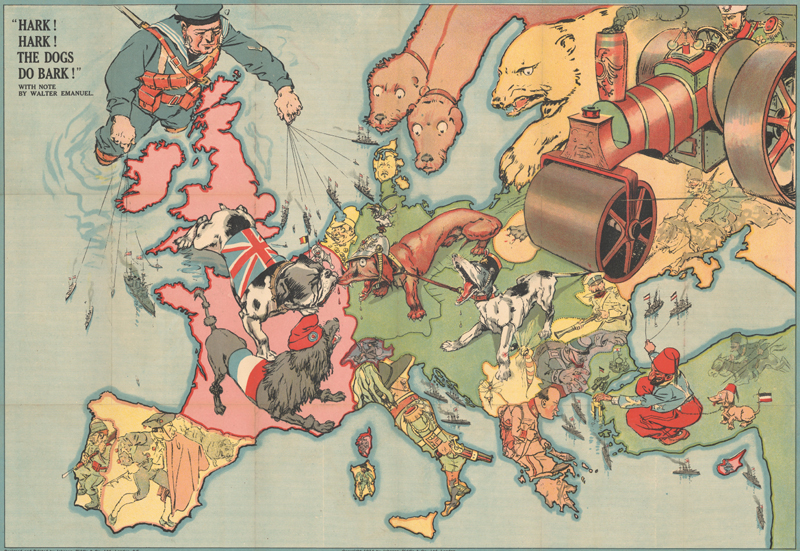
Hark! Hark! The Dogs Do Bark! (1914)
This political caricature map of Europe depicts the continent at the outbreak of World War I. The principal countries in the conflict are depicted as the Dogs of War. Germany is identified as an aggressive Dachshund attached to its Austrian ally shown as a yapping mongrel. Opposing them is the dandified French Poodle and the British Bulldog who has chomped onto the Dachshund's nose. Russia is depicted both as a traditional bear and as a massive steamroller driven into the heart of Europe by a determined-looking Tsar. A giant British sailor is puppeteer for a huge naval fleet, while a Turk with his pet Dachshund controls a small German fleet in the Black Sea. The other countries are also boldly caricatured with humorous illustrations. The title draws on the Mother Goose nursery rhyme. Designed and printed by Johnson, Riddle & Co. and published by G. W. Bacon & Co.
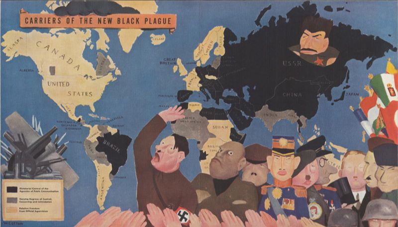
Carriers of the New Black Plague (1938)
This pictorial map is color-coded to show the extent of the "black plague" across the world. A key at bottom shows three categories of free speech: dictatorial control (black), varying degrees of control (gray), and relative freedom (tan). The map reveals that slightly more than half of the globe is in "Totalitarian Eclipse." Within the map image are ten of these dictators "whose ten totaled brains wouldn't counterbalance that of one Einstein in the measurement of man's distance from the anthropoid ape" including Hitler, Mussolini, Franco, and Stalin (by himself). Drawn by William Cotton and issued in the very first edition of Ken Magazine, a controversial anti-fascist magazine.
The Age of Innovation
From airplanes, to television, to the internet, the 20th century saw a huge wave of innovation. Within the world of cartography, this innovation spawned new types of maps, such as auto road maps and aeronautic charts, as well as more sophisticated uses for maps, such as advertising, political propaganda, and tourism. As a result, there is a wider range of types of maps in the 20th century than any other period in history. Within this wide range exists an interesting dichotomy of utilitarian maps and pictorial maps. These utilitarian maps, produced by companies like Rand McNally, served a very different purpose than pictorial maps, commissioned of artists and mapmakers like MacDonald Gill and Jo Mora. Regardless of purpose, these maps were made available to greater masses of people than ever before - people who sought a better understanding of their nation, society, and expanding worldview. Maps helped people envision their place in the world and the changes occurring around them. At the end of the 20th century, the introduction of digital mapping fundamentally altered mapmaking and the way people use and think about maps. Yet despite transitioning from paper to screens, maps continue to play in integral role in our daily lives.
Akerman, James R., "American Promotional Road mapping in the Twentieth Century", Cartography and Geographic Information Science, Vol. 29, No. 3, 2002, geography.wisc.edu/hoc/wp-content/uploads/sites/3/2017/04/06akerman.pdf. Accessed 4 August 2020.
Barber, Peter, The Map Book, Walker & Company, New York, 2005.
Bird, Curtis, "Pictorial Cartography Its American Expressions," IMCOS Journal Number 147, London, Winter 2016.
Burdon, Elisabeth, "Macdonald Gill The Wonderground Map of 1913 and its Influence," IMCOS Journal Number 116, London, Spring 2009.
Burton, Alford H., "History of the Aeronautical Chart Service," 2008, WWII Escape Maps, www.escape-maps.com/escape_maps/history_aeronautical_chart_service.htm. Accessed 4 August 2020.
Creason, Glen, "A Smile of Understanding A Map Librarian's Tale of Overlooked Treasure," Mercator's World Volume 4 Number 5, Eugene, Oregon, September/October 1999.
Curtis, Philip & Jokob Sondergard Pedersen, War Map: Pictorial Conflict Maps 1900-1950, The Map House, London, 2016.
Gaimo, Cara, "The Cowboy Cartographer Who Loved California," Atlas Obscura, 30 August 2018, www.atlasobscura.com/articles/jo-mora-california-maps. Accessed 3 August 2020.
Hornsby, Stephen J., Picturing America: The Golden Age of Pictorial Maps, University of Chicago Press, Chicago, 2017.
Manasek, F.J., Curt Griggs & Marti Griggs. Collecting Old Maps, Old Maps Press, Clarkdale, Arizona, 2015.
Modelski, Andrew M., Railroad Maps of North America: The First Hundred Years, Library of Congress, Washington, 1984.
Ristow, Walter W., American Maps and Mapmakers: Commercial Cartography in the Nineteenth Century, Library of Congress, Washington, 1985.
Walker, Caroline, "Discovering MacDonald Gill: A Brief Biography," Out of the Shadows: The MacDonald Gill Symposium, 2011, arts.brighton.ac.uk/__data/assets/pdf_file/0005/69062/C-Walker,-Discovering-MacDonald-Gill-v2.pdf. Accessed 3 August 2020.