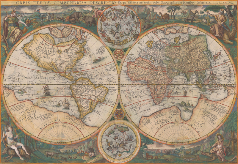
A stunning example of Jan Baptist Vrients' world map issued in full original color in 1596.
A Historical Survey of Color on Maps
by Eliane Dotson
When examining an antique map, the engraved lines, the symbols, the text and the adornments all make a big impression (no pun intended), however the use of color on maps has also played an important role. Color was widely used on medieval manuscript maps, and so it is no wonder that color was intentionally added to some of the earliest printed maps. In general, there are two primary purposes for which color was used on maps: for decoration and to relay information. That color enhances the decorative nature of maps is obvious, but color was also used to convey information by emphasizing important features on maps, differentiating between regions, or conveying cultural symbolism. Whether or not color was used on a map, and how the color was used, are important factors in understanding historical maps.
Although there were many different types of printing methods and printing surfaces in the history of maps, there were only two ways that color was applied: either by hand or as part of the printing process. The techniques and styles for applying color changed over the centuries along with advances in engraving and printing. While there are a few instances of printed color on maps in the early sixteenth century, the vast majority of colored maps were done by hand until the middle of the nineteenth century. The shift from hand color to printed color was driven by technological breakthroughs in lithography, but before then, hand coloring, also known as illumination, was an entire industry associated with manuscripts and, later, the printing trade.
Hand-Colored Maps
In medieval times, prior to the invention of the printing press, all maps were drawn by hand and color was frequently incorporated. Pigments were made with natural materials (primarily minerals, plants, and insects) that were combined with binders, such as glair (beaten and settled egg white), gum and starch. The colors were typically opaque and were applied using pens or brushes. Contrasting colors were used to highlight important features, and many of the colors used were based on cultural and religious symbolism, including associations of specific colors with the cardinal directions, elements, and seasons. During the Renaissance, artists shifted their use of color from the medieval symbolic view to one based on the study of nature itself, thereby representing color in a more realistic way, which has carried forward to today. At the time, due to the cost of the materials and the time required to color them, the use of colored maps was limited to the nobility and the church.
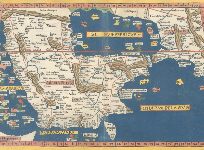
Printed maps began appearing on the European market a few decades after the invention of the printing press (circa 1450). These very first maps were printed in black ink and were not colored. However, in 1482, Leinhart Holle printed an edition of Ptolemy’s Geographia in Ulm that featured hand-colored maps. The woodcut maps were printed in monochrome and then were colored in a workshop in a specific coloring scheme, with the oceans colored in a rich, vibrant blue made from the rock lapis lazuli, mountains colored brown, and regions distinguished using green, yellow and pink.
This map of Arabia from the 1482 Ulm edition of Ptolemy’s Geographia features gorgeous blue oceans hand painted with a lapis lazuli pigment.
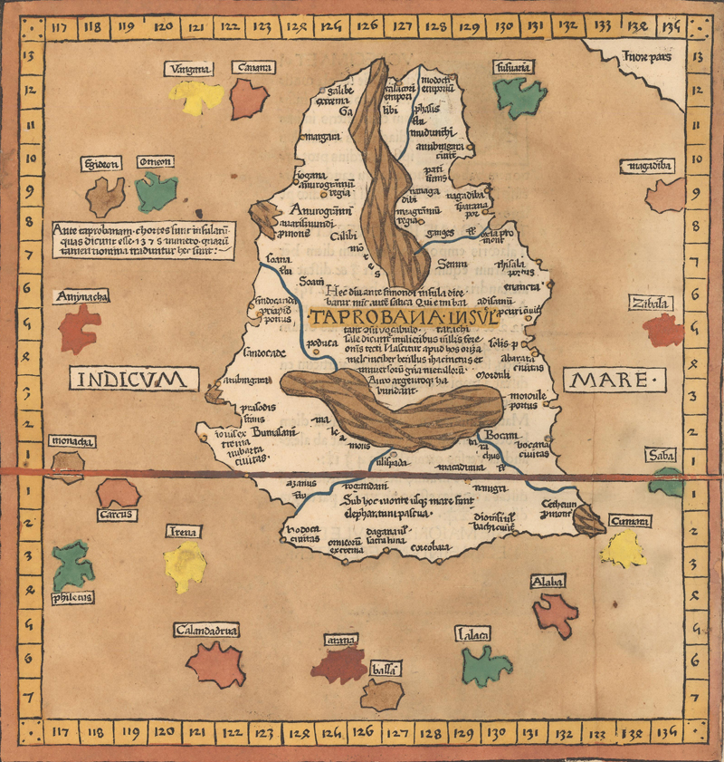
Another edition of Ptolemy’s Geographia was printed in Ulm in 1486, this time by Johann Reger, and was also issued with a predetermined coloring scheme, distinguished from the 1482 edition by having the oceans colored light brown, instead of blue. These two atlases were exceptions to the norm for early printed maps, which were more commonly left in their original monochrome state. A map image printed in black was considered complete, and color was a supplementary element.
This map of Sri Lanka from the 1486 Ulm edition of Ptolemy’s Geographia has the oceans colored brown.
Although the early Italian map publishers preferred their maps uncolored so as not to obscure the quality of their engravings, many sixteenth and seventeenth century mapmakers offered their maps both uncolored and colored, for an additional fee.
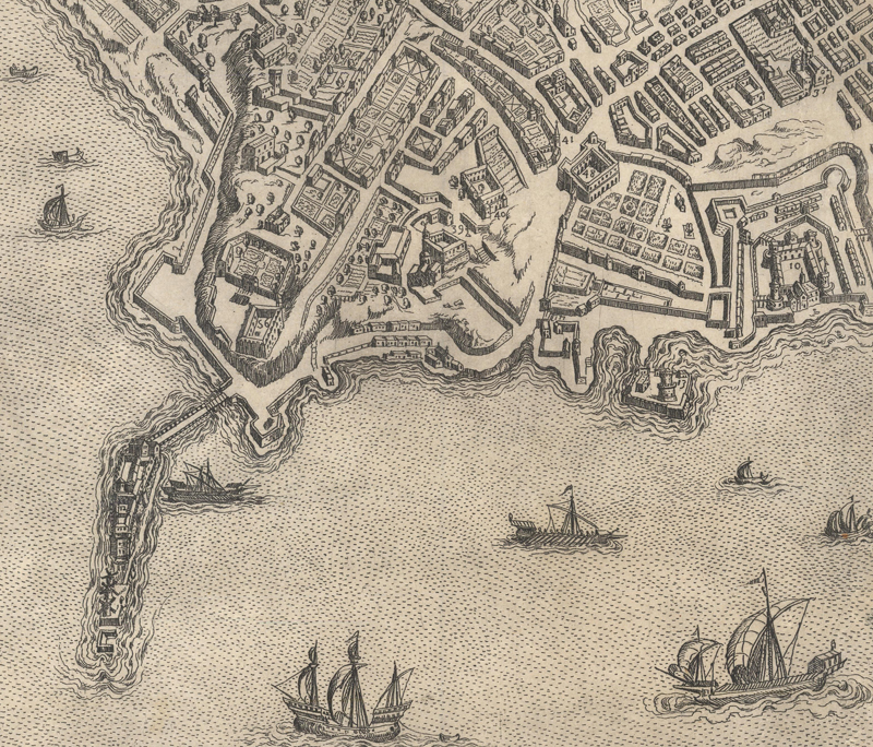
This close-up image of Antonio Lafreri’s 1566 view of Naples illustrates the impressive engraving quality of Italian maps.
Map shops employed colorists for this purpose, although a customer could also purchase an uncolored map and bring it to an illuminator’s shop to have it colored to their personal taste. Thus began a divergence in the quality and style of hand coloring. Whereas the maps in Holle’s and Reger’s editions of Geographia displayed standardized colors and application of color, maps could be purchased and colored based on an individual’s whim. The diversity in hand coloring of maps was further compounded by the fact that it became a common pastime of the upper class in the seventeenth century, as evidenced by the number of instructional books published on amateur map coloring at the time. John Smith’s The Art of Painting in Oyl (1687) includes an entire chapter on “A Discovery of the Mystery of Back Painting Maps, or Prints in Oyl-Colours; so much now in use,” which describes the technique, gives directions on mixing the pigments, and suggests which colors should be used for various elements on a map.
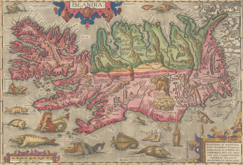
While many variations in hand coloring can be found, there were some general standards from different time periods and in certain countries. Woodblock maps, which were the dominant form of printed maps through the early sixteenth century, were less commonly colored, however when color was applied it was often fairly opaque. Once mapmaking shifted to copperplate maps, colorists transitioned to transparent watercolors in order to showcase the crisp lines and intricate details of the engravings. During the Golden Age of cartography in the late sixteenth and early seventeenth century, which was driven by the Dutch and Flemish, hand-colored maps featured wide bands of outline color, full washes of color within each region, and intricately colored cartouches and decorative elements. This style is evidenced by Abraham Ortelius and Gerard Mercator’s atlases. Later in the seventeenth century, outline color was applied more thinly, washes became more transparent, and cartouches became even more elaborate, sometimes illuminated with gold or silver highlights for presentation pieces. The families of Blaeu, Hondius, and Jansson all offered this style of coloring for their maps.
An example of the coloring style in Abraham Ortelius’ atlases in 1595.
An example of the coloring style in Willem Blaeu's atlases circa 1640.
In contrast, the French and English mapmakers were more reserved with hand coloring, typically only employing light outline color to mark boundaries and leaving cartouches uncolored. Pierre Duval, Nicolas Sanson and Guillaume Delisle were some of the notable Frenchmen who adhered this minimalistic style, as were Englishmen Herman Moll and Thomas Jefferys. Early German map publishers, such as Matthias Quad and Matthaus Merian, opted to leave their maps monochromatic, however the Germans’ coloring conventions changed in the seventeenth century. Gerard Valck, Johann Baptist Homann, Matthaus Seutter, and others presented their maps with heavy washes of bold color (typically yellow, pink and green) to differentiate each region, while leaving cartouches and decorative elements uncolored. This approach was advocated by Johann Hübner, who asserted in his Museum Geographicum (1726) that color should only be used for functional purposes, not decorative: “One can spoil a map through the use of color, rendering it of less service than if it were merely in black; yet, conversely, one can so enhance it through color that the study of geography is thereby significantly facilitated.”
An example of the coloring style in Nicolas Sanson’s atlases circa 1660.
An example of the coloring style in Johann Baptist Homan's atlases circa 1720.
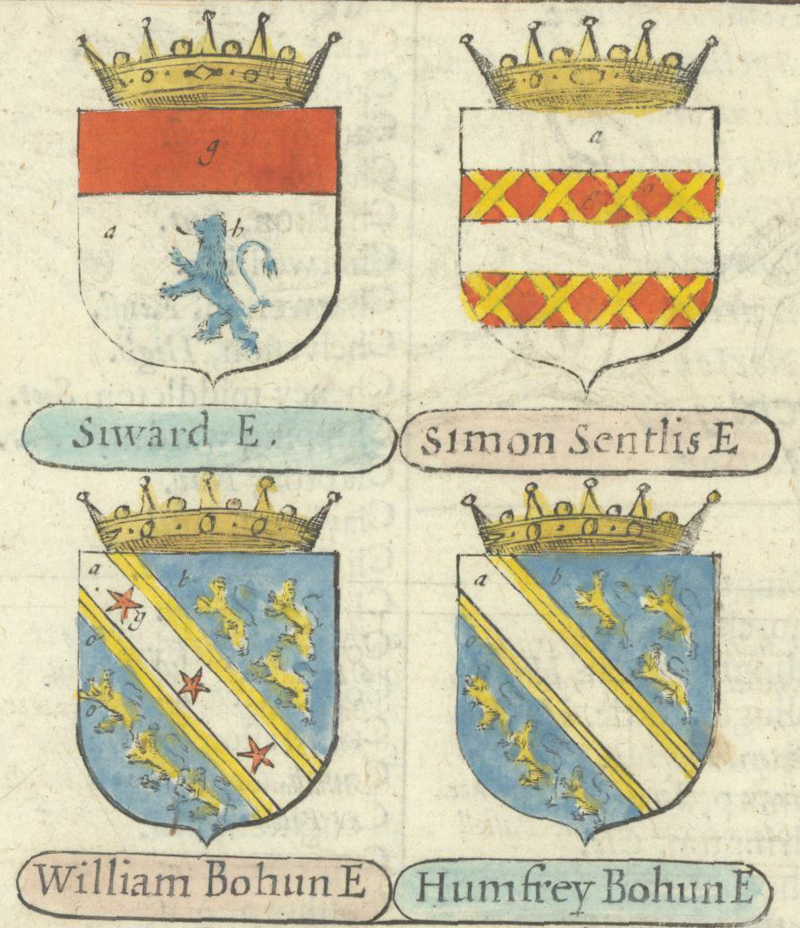
Some map publishers gave instructions on how their maps should be colored, and one of the best-known examples is with John Speed’s maps from his The Theatre of the Empire of Great Britaine. Although Speed sold his atlas both in monochrome as well as hand-colored, he also included notations on the maps so the heraldry could be properly colored by a professional illuminator’s shop or by an amateur at home. The correct color was denoted by the abbreviation for the heraldic name or by specific hatching, such as “O” (which could be depicted by dots) as an abbreviation of “Or” to be colored in gold or yellow, or “G” (which could be depicted by vertical lines) for “Gules” to be colored in red. Unfortunately, many mistakes remain in the coloring of heralds on Speed’s maps. Some of the heraldic abbreviations are incorrect on the maps, whether from inaccurate sources referenced by Speed, or due to the engraver’s error. In addition, some colorists may not have been aware of the coding system or mistook one symbol for another. Even with standards and guidance, hand coloring was an artform that resulted in a wide range of coloring trends, techniques and skill.
The coats of arms on John Speed’s map of Northamptonshire have engraved letters to instruct the colorist, with “o” for yellow, “a” for white, and “b” for blue.
Identifying Old Versus New Hand Color
One of the more contentious issues in the map trade is the difference between old and new hand color. To begin with, there are different terms used to describe color that relate to when it was added to a map. Original color typically describes color that was added by the mapmaker or publisher in their particular style, whereas contemporary color (or period color) refers to color that was added around the time the map was published. Contemporary color may have been done by an illuminator’s shop or by an amateur. Later color (also called modern or recent color) was applied well after the map's publication. It is a broad term that doesn’t narrow down when the color was applied; later color could have been applied yesterday in a startling replica of the old style or hundreds of years ago by the map’s previous owner. Because it tends to impact the value of the map, it is helpful to know if an example is in original or contemporary color versus later color. Unfortunately, distinguishing between them isn’t always straightforward.
However, there are some tips that can help identify old versus new color. First of all, the colors used and the application of the color must be in line with the map publisher or time period. This requires experience in knowing what to expect for a given map, and comparing a questionable example with one that is known to be in original color will help. Complete atlases held in institutions are good comparables, as they are more likely to have original color. Second, one can look on the back of the map to see if the color has bled through, which is an indicator that the map has later color. As colorists primarily used watercolors on maps, the paper had to be treated with sizing prior to the application of color in order to prevent the paper from absorbing too much color. Sizing was made from various materials, such as gelatin, starch or egg white, and the paper would be brushed with the sizing or dipped into a tub of sizing. Modern watercolor paper is manufactured with sizing already in it, but prior to the nineteenth century paper was traditionally not, so sizing the paper is sometimes neglected by modern colorists. One caveat to this is with eighteenth century German mapmakers, such as Homann, whose heavy washes of color occasionally bled through to the back of the map. With these maps, it is critical to match the shades used on the map and use other contextual clues.
This is an egregious example of watercolor bleeding through to the verso of a map that was not properly sized prior to coloring.
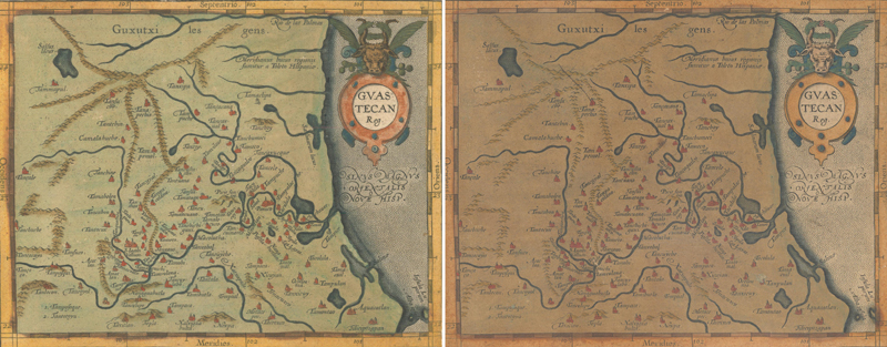
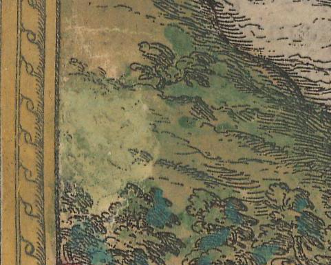
For maps from the sixteenth and seventeenth centuries, the green pigments on maps can give clues as to when the map was colored. Verdigris, a common pigment used at the time, was made by exposing metal (copper, brass, or bronze) to acids (such as vinegar or sour wine). When exposed to light and humidity over time, verdigris shifts in color from emerald green to darker green, and then to brown.
These two examples of Abraham Ortelius’ map of the coast of Mexico demonstrate how the original verdigris pigment can turn from green to brown over time.
The acidity in the pigment also affects the paper, first seeping through to the reverse side of the map, and eventually causing the paper to become brittle and to crack. These visible clues can help identify old color; however, some modern colorists have learned to replicate the changes in color and how it seeps through to the verso of the map, which requires a trained eye to distinguish.
The above images show both the recto and verso (mirror image) of a Moses Pitt map from 1680 that used verdigris pigments. At left, the green pigment has made the paper brittle, causing cracks and a small hole to form. At right, the verso of the map shows how the green and turquoise pigments are visible through the paper on the back of the map.
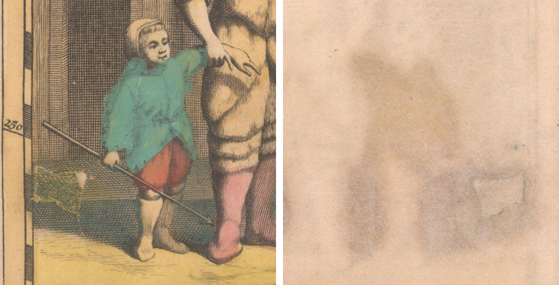
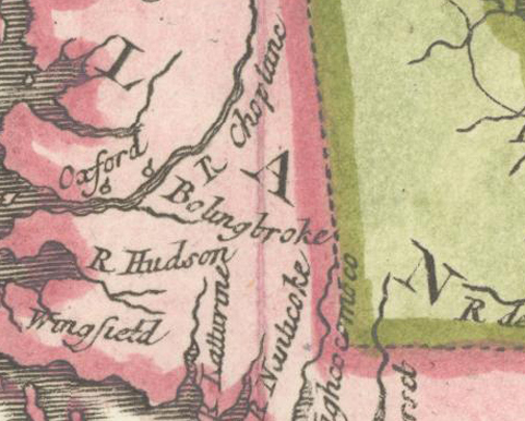
The final tip to identify original color is to examine how the color appears within any folds or repairs on the map. If the color is heavier along the folds, then it was colored later, as maps were hand colored by the map publisher prior to being inserted in an atlas or book. Similarly, if there are repairs on the map, any color that was applied (or retouched) after the repairs were made will lay differently than on the rest of the map. And if the map was washed or bleached, original colors may have faded and required modern touch-ups; this is particularly true of red pigments, which are less steadfast.
Later color will often absorb more heavily within the original fold lines, as evidenced within the vertical fold through the center of this image.
This map has a repair adjacent to the border at left that has been retouched with new green pigment, which appears quite different in tonality to the original green pigment adjacent to it.
The Advantages and Disadvantages of Original Hand Color
It is generally accepted that a map with original color holds more value than the same map in monochrome or with later color. And yet, a map in original hand color may not always be the best option. Maps that were offered by the publisher both uncolored and colored can now be found in the map market in monochrome, original color, contemporary color, and later color. While a map in original color is typically the most valuable of those options, the exception is with examples that have verdigris damage or other significant condition issues. In these instances, a map with later color in excellent condition is often preferable to one with original color in lesser condition.
Where later color is concerned, there is no exact formula for how it affects value. There are a lot of variables in play, the most important (and volatile) of which is the collector's individual taste. Still, some trends do prevail. Certain maps, particularly most fifteenth and early sixteenth century maps, were only issued uncolored, and therefore, these maps are preferred in their natural state. With maps printed later in the sixteenth century and beyond, given the choice, most collectors will take an example in attractive (ideally period correct) modern color over a black-and-white example in similar condition. For many, condition is a bigger factor than original color in deciding whether to buy a map and what the map is worth. There is a subset of "purist" collectors that would rather have a map in its original black-and-white than in later color, however, they do not represent the majority. With later color, it is important that it was done with skill and historical appropriateness. And because there are usually fewer maps in original hand color, and they tend to sell for a premium, later hand color can be a better option for some collectors.
Maps with Printed Color
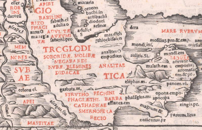
Although maps with multiple printed colors didn’t become common until the late nineteenth century, the earliest examples actually appeared on the market in the early sixteenth century. The first example of color printing on maps was on the 1511 edition of Ptolemy’s Geographia printed by Jacobus Pentius de Leucho in Venice. The woodcut maps were printed in black with certain place names and headings printed in red ink by means of type set into the woodblock and applied with a second strike of the plate.
A map from the 1511 Venice edition of Ptolemy’s Geographia printed in both black and red ink.
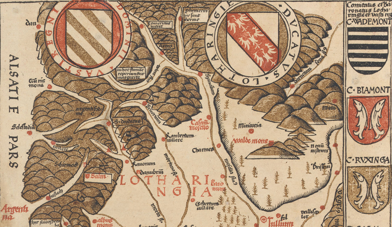
The next instance of early printed color appeared on a single map in the 1513 edition of Ptolemy’s Geographia printed by Johannes Schott in Strasbourg. The woodcut map of Lotharingia was printed in three colors (black, red, and yellow/green) from three separate woodblocks. Known examples vary in both color and hue due to different pigments used, and also in the alignment of the images.
The map of Lotharingia from the 1513 Strasbourg edition of Ptolemy’s Geographia printed in black, red and green. (Image courtesy of Yale Center for British Art, Paul Mellon Collection)
After these two examples, printed color all but disappeared in the mapmaking industry until the nineteenth century due to the associated challenges and costs. The technology of color printing lagged far behind the invention of the printing press, so hand coloring became the norm for over three-hundred years until the challenges of color printing could be resolved.
The biggest issue regarding color printing was registration, which required precise alignment of the printing block (or blocks) that had to be pressed on the paper sequentially for each color added. One method of registration was to create identical marks on the edge of each of the plates to help align the paper on which it would be printed. Another method was to affix pins to the tympan (which held the paper within the printing press), and then match the pins to holes pierced into the plate. Registration became even more challenging with intaglio printing, which used a rolling press, rather than the classic printing press used for woodcuts. Because registration was problematic and time-consuming for both relief and intaglio printing, it discouraged the use of color printing.
The other issue faced by early printers was in applying large areas of solid color. Printing a large area in color was possible with a woodcut, a relief printing method in which the raised, uncut surface was inked and pressed onto paper; however, once map production shifted primarily to intaglio printing on copperplates, this was no longer possible. In the intaglio method, lines were cut into the plate and ink was rubbed into the engraved lines. The effect was crisp, precise lines, not large areas of color. There were sporadic experiments with relief and intaglio color printing over the centuries, but all were found to increase the time and cost of production significantly enough that they were not widely adopted in cartography.
Of course, the mapmaking industry could have simply continued with hand coloring (and did, even after color printing had been perfected), but there were drawbacks to hand color. It was a labor-intensive process that resulted in inconsistent results. An entire map coloring industry was established in Europe, but there remained a wide range in skill and application of color. In addition, even though lower-cost labor such as women and children were sometimes employed as colorists, the cost of coloring increased the price of a map or atlas by 25% to 50%. As demand for maps and other printed materials increased due to rising literacy and the growth of the middle class, a cheaper and less time-consuming method for adding color to maps was necessary.
In order for color printing to gain traction, innovation in printing methods was essential. The innovation came in the form of lithography, a planographic method invented in 1796 by Alois Senefelder, in which the image was drawn onto a smooth surface before being transferred to paper. Because the lithographic plate or stone was smooth, it could handle text, line and point symbols, as well as solid areas of color. In the first half of the nineteenth century, the importance of color printing was recognized and breakthroughs were occurring around Europe and in the United States. The printing industries in various countries were all competing to solve the problem of color printing. To encourage innovation, the Société d’Encouragement pour l’Industrie Nationale in France offered a prize of 2,000 francs in 1828 for the successful invention of a color printing process, and as a result a number of examples of color printing were displayed at the 1839 Industrial Exposition in Paris. Many different formulas for pigments, techniques for applying ink to the plate, printing machinery, and registration methods were tested throughout the century in France and elsewhere.
The variety of colors that could be printed on a single map was somewhat limited in the beginning, as individual plates had to be created for each color and successively printed on the same sheet. Tinted lithographs were usually printed from two stones: the first in black for the lines and letters, and the second (or occasionally a third) to provide a muted background wash or tint. Of course, printers were eager to print in an array of colors, but first they had to overcome the hurdle presented by the opacity of oil-based inks that were used in lithography, which obscured the text and lines of a map. This issue was first addressed by breaking up areas of color into dots or lines of varying width and spacing to create a more transparent effect.
An early tined lithograph published circa 1845 in August Nicolas Vaillant’s Voyage Autour du Monde.
A map printed in 1842, likely by Morse & Breese, showing how the density of lines could create lighter shades of color.
This process led to chromolithography, in which multiple stones or plates were prepared – one for each color – some for flat areas of color and others for individual details, like railways or symbols on the map. The technique of using dots or stippling allowed printers to create additional colors by overlapping primary colors, thereby reducing the number of stones or plates needed. Chromolithography became widely used for maps, prints, journals, advertisements, and even children’s books, and by the second half of the nineteenth century, lithographers were printing maps in a multitude of colors and hues.
The 1855 title page to Charles Desilver’s A New Universal Atlas employs different patterns of color and overlapping colors to create additional hues.
Distinguishing Hand Color from Printed Color
For maps printed after 1840, discerning hand color versus printed color requires a keen eye. A general rule of thumb is that lithographs printed prior to 1850 are most likely hand color, and those after 1875 are most likely printed color. However, there are many nineteenth century maps that include both original hand color and printed color, as it was a time when color printing technology was still being perfected.
An example of the use of printed color in conjunction with hand color on August-Henri Dufour’s map of the United States published circa 1840. The railroad lines and capitals were printed in red and the state boundaries were later added with hand color.
Similarly to identifying original color, it is helpful to first determine how a particular mapmaker published their maps. For more obvious visual clues, areas of color can be viewed under a loupe (magnification of 10x is sufficient); early printed color is evidenced by dots or lines of color, as compared with seamless watercolor that was applied by hand. Another simple way to identify color printing is when there is poor registration, in which a block of color is uniformly shifted away from its intended location in one direction, but still retains the correct shape.
In general, printed color will appear more consistent in hue and application than hand color, which will show irregularities where the pigment will have been applied more heavily in certain areas, or will overlap another color unevenly, or will be applied without respect to the printed lines.
One method of hand color that is often mistaken for printed color is the use of stencils to apply color. This method is still considered hand color, since the color is applied by hand, but stencils created a more uniform appearance than traditional hand color. Stencils were used as early as the sixteenth century to apply color on broadsides, and on maps as late as the 1880s to compete with printed color. Each map would have a different stencil sheet cut for each color that needed to be added, which sped up the process of adding hand color and prevented coloring errors. As compared with printed color, stencils will still present some signs of watercolor, such as brushstrokes or unevenness of application, particularly along the edges of an area of color.
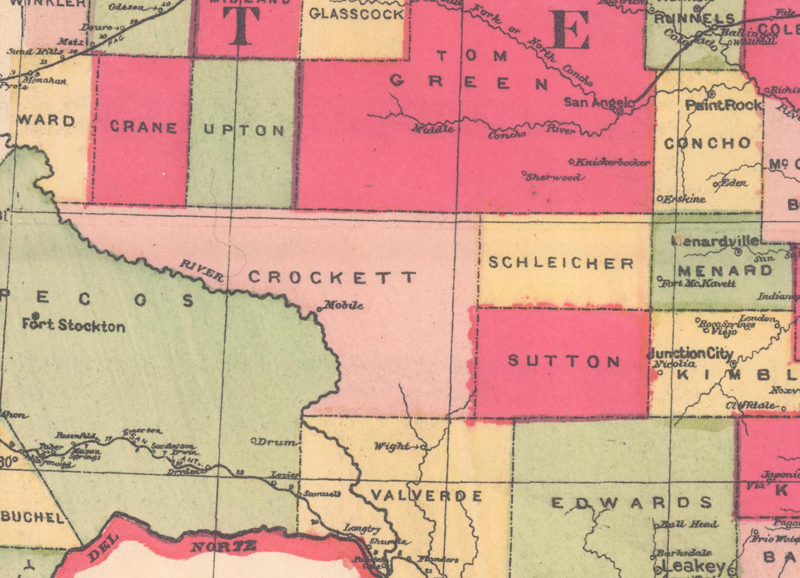
Stencils were employed in some atlases to hand color counties more quickly and consistently, such as on this H. C. Tunison map of Texas published circa 1889. Signs of hand color are apparent, such as brush strokes in the large green county at left, and uneven color application along the edges of some counties where the ink seeped beneath the stencil.
An Appreciation for Color on Maps
Color is often the first thing one notices when looking at an old map. Because color can impact both the condition and value of a map, it is important to understand how color was applied to maps over the centuries. While discerning hand color from printed color is fairly straight-forward, the nuances of hand color, particularly concerning when it was applied and by whom, is a challenge even for experts. There are a number of clues that help in recognizing modern or later color, but it is difficult to identify original hand color (versus simply “old” color) with absolute certainty. This is where experience plays a starring role in knowing what application styles and hues should be expected from different time periods, countries, and map publishers. All else being equal, original color (and, for the most part, even old color) will come at a premium to later color, so knowing the difference, and buying from those with true expertise in maps, can prevent collectors from being misled.
Then comes the question of what role color plays on a map, and given the choice, should one opt for a map in monochrome or color? One should consider whether color enhances the features of the map and helps to tell the story of why the map was made. Just as there are examples of maps that are preferable in black and white, such as an intricately engraved sixteenth century Italian map, there are others that would be practically unusable without color, such as a geological map depicting numerous types of rocks and minerals. Barring these extreme ends of the spectrum, many maps can be found in both uncolored and colored examples, and for these it depends on one’s individual preference. Provided that it is done appropriately, color can certainly enhance the artistic nature and even the value of a map. As with any visual medium, color is an important component, and understanding how and why color was applied to maps over the centuries can help us better appreciate maps.
References:
Bamber, Gasgoigne, How to Identify Prints: A Complete Guide to Manual and Mechanical Processes from Woodcut to Ink-Jet (Thames and Hudson, 1988).
Carlson, Lage, “An Interim Treatment for Paper Degraded by Verdigris,” in The American Institute for Conservation, Volume 16 (1997).
Ehrensvärd, Ulla, “Color in Cartography: A Historical Survey,” in Art and Cartography, ed. David Woodward (University of Chicago Press, 1987).
Kretschmer, Ingrid, “Reproduction of Maps: Color Printing,” in The History of Cartography, Volume Four, ed. David Woodward (University of Chicago Press, 2020).
Lane, Chris, “The Color of Old Maps,” Mercator’s World Volume 1 Number 6 (1996).
Price, Carol, “A Brush with Colour,” The Map Collector Issue 63 (1993).
Ristow, Walter W., “Lithography and Maps, 1796-1850,” in Five Centuries of Map Printing, ed. David Woodward (University of Chicago Press, 1975).
Van Duzer, Chet, “Colored as its Creators Intended: Painted Maps in the 1513 Edition of Ptolemy’s ‘Geograpy’,” Imago Temporis. Medium Aevum, XIII (2019).
Verdier, Nicolas and Jean-Marc Besse, “Color and Cartography,” in The History of Cartography, Volume Four (University of Chicago Press, 2020).
Woodward, David, “Techniques of Map Engraving, Printing, and Coloring in the European Renaissance,” in The History of Cartography, Volume Three Part 1, ed. David Woodward (University of Chicago Press, 2007).