The Splashy World of 20th-Century American Pictorial Maps
Putting the “Art” Back in Cartography: The Splashy World of 20th-Century American Pictorial Mapsby Joe McAlhany
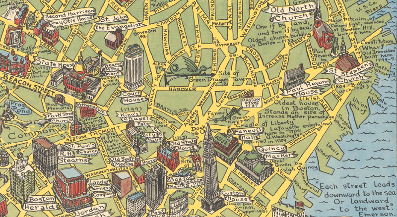
A dragon, a giant grasshopper, and the Boston Massacre: detail from Alva Scott Garfield’s A Scott-Map of Boston Massachusetts (circa 1955) [Click on image to learn more about this map]
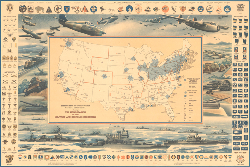
A map of Boston (“not a city, but a state of mind”) where the horrors of the Boston Massacre can be found just down the road from a dragon and a giant grasshopper. A World War II-era map of the United States focused on the nation’s military and industrial strength that is surrounded by battleships, artillery, bombers, and tanks. A plan of the ganglands of Chicago that features a regal Al Capone hovering above the title cartouche and a vignette showing a gangster trimming his hedges with a machine gun. A literary map that tracks Ahab’s bloody pursuit of Moby Dick from Massachusetts to the Pequod’s watery grave in the Pacific, complete with illustrated scenes from Herman Melville’s classic. A Prohibition-era map of the skull-shaped Isle of Pleasure that helps you navigate the State of Inebriation from John Barleycorn’s grave to the “Sanitorium for Those Ale-ing” (just watch out for the sea monster Old Delirium Tremens). What do these seemingly disparate maps have in common? All of them sprung from what Professor Stephen J. Hornsby has dubbed the “golden age of American pictorial maps,” which spanned from the 1920s through World War II and eventually fizzled out by the end of the 1960s.
Heavy artillery: C.S. Hammond & Co.’s Defense Map of United States … Showing the Mobilization of Our Military and Economic Resources (circa 1942) [Click on image to learn more about this map]
Every map, no matter how objective it seems to be, tells a story. But the pictorial maps that became an American pop cultural phenomenon in the 1920s and 30s tell their stories at full volume in splashy Technicolor. Throughout the history of cartography, many maps have incorporated decorative text and images, whether in the form of elaborate title cartouches, drawings of ships and sea monsters in the oceans, city views, or other illustrated elements. The 20th-century American pictorial maps take that graphic tendency to its limit, folding the modern aesthetics of emerging mass art like advertising, posters, cinema, comics, and cartoons into the world of cartography, injecting maps with a new kind of color and verve.
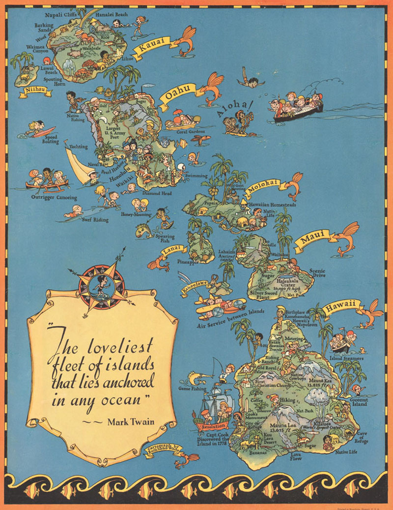
A new kind of color and verve: Ruth Taylor White’s Hawaii The Travelers' Treasure Islands (circa 1935) [Click on image to learn more about this map]
In the early days of the 20th century, the art of mapmaking in America had taken a somewhat stodgy turn towards the strictly scientific. Maps tended to be accurate, practical, and useful, largely devoid of decorative detail. Pragmatic atlases by Cram and Rand McNally, utilitarian National Geographic inserts, and “gas maps” issued by oil companies supplanted the lively lithographed broadsides and bird’s-eye views that enjoyed a period of popularity in the decades following the Civil War. While these maps still hold interest for certain collectors, they reflect a major shift in the history of maps: the scientific art of cartography had become just the science of cartography.
As if in reaction to this trend, the renaissance in American pictorial maps brought art back to cartography in an audacious way. After all, these illustrated maps were produced not by trained cartographers, but by commercial artists guided less by questions of geographical accuracy than by questions of design. Their maps might not be much help in navigating from Point A to Point B, but they accomplished something that an ordinary road map could not do: they communicated something essential about a place in a way that appealed to a popular audience. As Hornsby puts it, they reveal the “collective memory” of a place, its gestalt—the people and their topography, history, and pride.
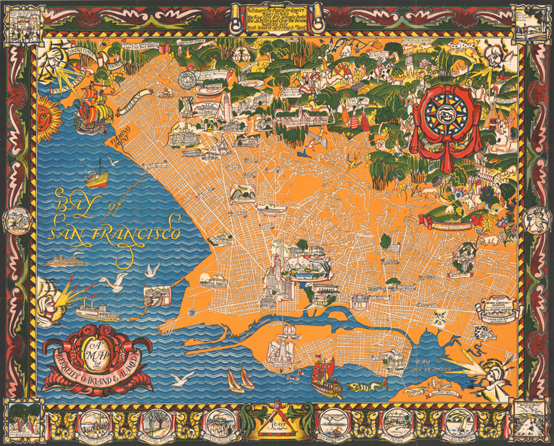
The “collective memory” of the Bay Area: Michael Baltekal-Goodman and Eugene Neuhaus’s A Map of Berkeley Oakland & Alameda (circa 1930s) [Click on image to learn more about this map]
Take, for instance, Michael Baltekal-Goodman and Eugene Neuhaus’s stunning A Map of Berkeley Oakland & Alameda, published sometime in the 1930s. While it does show streets in grid form, it is less useful as a guide for getting around. But it provides the viewer with a real feeling for the region’s history, culture, and general spirit. The map synthesizes a number of eras in both content and style, so it is as if all time is happening at once. Flourishes influenced by the Art Nouveau and Art Deco movements combine with decorative touches like windheads, sea monsters, and ornate cartouches that harken back to the earliest printed maps. “The Old Indian Village Life” is depicted alongside the early Spanish settlers and the modern Oakland Municipal Airport, while San Francisco Bay teems with galleons, freighters, ferries, and sail boats from various eras. Specific historical episodes are detailed in vignettes embedded in the border. In the urban areas, there are copious examples of landmarks and architecture, and the surrounding countryside is illustrated in vibrant detail, complete with rolling hills, beautiful vegetation, and prancing wildlife. Even the color scheme of sunny oranges and lush greens seems to communicate something intangible about the area. Old World Auctions has previously described Baltekal-Goodman and Neuhaus’s piece of Californiana as “more a work of art than a map;” the best of the 20th-century American pictorial maps ride that line and ultimately erase the difference.
Like all artists, the creatives behind the wave of American pictorial maps were responding to broader trends in contemporary art and culture. America was on an upswing in the 1920s, experiencing an unprecedented renaissance as both an economic powerhouse and a cultural exporter, which, among other things, led to an influx of advertising dollars. Pictorial maps grew out of the flourishing world of advertising, which both absorbed and perpetuated the influence of the fast and flashy visual language of Jazz Age pop culture like comic books and movies. American artists were also keenly tuned into innovations coming out of Europe. Uruguayan-British typographer and craftsman Edward Johnston revolutionized the fields of design and topography with his 1906 publication Writing & Illuminating & Lettering, a bible for graphic artists. In the late 20s, Art Deco finally hit American shores as exhibits popped up in big cities; the movement’s emphasis on color, geometry, ornamentation, and modernity heavily influenced pictorial maps. Not all of the influences were so aggressively contemporary: the nostalgic patriotism and historical focus of the Colonial Revival movement also found its way into pictorial mapping.
“The most influential pictorial map ever published:” MacDonald Gill’s Wonderground Map of London (1914) (Image courtesy of David Rumsey Historical Map Collection)
If the American trend in pictorial mapping can be traced back to just one origin, it would be MacDonald “Max” Gill’s Wonderground Map of London, published in 1914. Described by Hornsby as “the most influential pictorial map ever published,” Gill’s map is distinguished by its striking colors, cartoon style, sense of humor, and blend of people, creatures, and buildings. It was commissioned by Frank Pick, the general manager of the London Underground Railway, as part of an ambitious marketing strategy that tasked commercial artists with creating posters promoting the subway. Despite their origins as advertisements, these posters became a cause célèbre in the international art world.
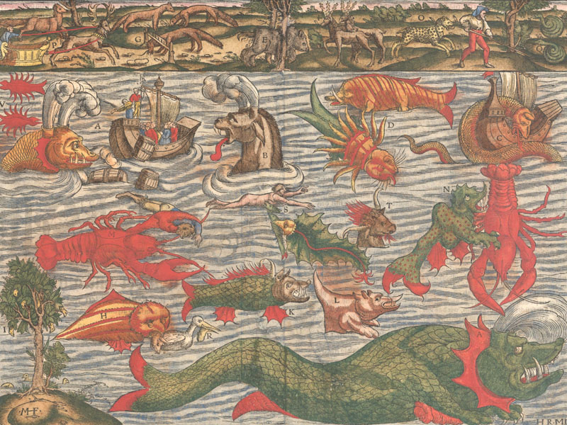
Sebastian Munster’s Monsters (circa 1578) are an important precursor to pictorial maps. [Click on image to learn more about this map]
Of course, the roots of pictorial maps go all the way back to the beginning of cartographic history. There is a direct line from the fantastical beasts on medieval European mappae mundi and Sebastian Munster’s monsters to the strange figures on pictorial maps. Braun and Hogenberg’s town plans are a definite influence, as are later bird’s-eye city views. Many pictorial maps feel like Dutch cartes-á-figures maps with the portraits, fashion plates, animals, historical scenes, and town views torn from the borders and grafted onto the landscape itself. The figurative representation of nations, whether it is Belgium and the Netherlands shown as a lion (Leo Belgicus), the Geographical Fun maps of Lilian Lancaster/Aleph, or satirical World War I maps, is also part of the genetic makeup of pictorial maps. (In general, there seems to be considerable overlap between satirical war maps, persuasive cartography, and the 20th-century wave of American pictorial mapping. You can read more about persuasive cartography here.) The American pictorial maps of the early 20th century pulled from this rich tradition of cartographic ornamentation and took it to its extreme.
Is it any wonder that Americans took notice? There was a genuine craze for pictorial maps, especially during the 20s and 30s. They turned up in newspapers, bookstores, souvenir shops, and department stores. Some were educational (they were the biggest innovation in teaching children geography since the puzzle map), others completely irreverent. They were commissioned by state tourist boards, national parks, oil companies, railroads, and the federal government, all of which were eager to stoke—and cash in on—interest in a place. During World War II, a fad for educational and patriotic war maps hit the American public. Unfortunately, this was the last major spike in the popularity of pictorial maps. In the decades following the war, the production of pictorial maps slowed to a halt as advertising money rerouted from illustrators to photographers.
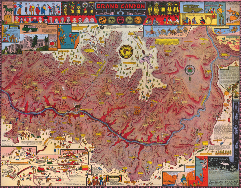
Jo Mora’s Grand Canyon (originally 1931, re-published in 1959) is a beautiful example of a pictorial map as souvenir. [Click on image to learn more about this map]
Because they were cheap and mass produced, pictorial maps were seen mostly as novelties and were rarely taken seriously by collectors. Fortunately, that seems to be changing today. Stephen J. Hornsby’s recently published Picturing America: The Golden Age of Pictorial Maps makes a convincing case for pictorial maps as a crucial and unheralded part of 20th-century American pop culture and art. Hopefully it leads to a groundswell of scholarly interest in the topic. The graphic artists that created these maps often took on the challenge as a side gig, a way to make a few extra bucks. But unbeknownst to them, they were part of the last gasp of cartography as a decorative art form—at least for now.
References:
Curtis, Philip and Pederson, Jakob Sondergard, War Map: Pictorial Conflict Maps 1900-1950, Sifton, Praed & Co. Publishing, 2016.
Hornsby, Stephen J., Picturing America: The Golden Age of Pictorial Maps, The University of Chicago Press, 2017.
Martin, Clive, “Striking pictorial maps tell the story of 20th-century America,” CNN Style, https://www.cnn.com/style/article/picturing-america-golden-age-of-pictorial-maps/index.html (accessed 3/23/18).