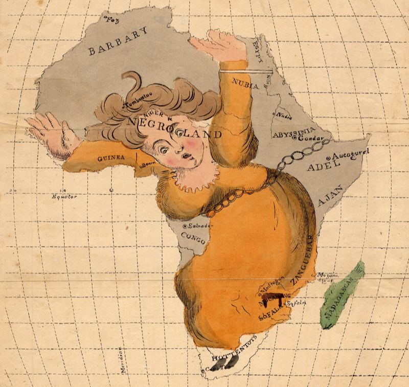
Anonymous map of Africa as a woman in chains (ca. 1850)
Maps Are People Too
by Joe McAlhany
[Click on any image in this article for more information on the map, and in most cases a zoomable image of the map.]
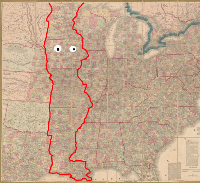
Do you know Mimal, the man in the middle of the United States of America? He is a hard character to miss with his clownish bulb nose, towering hat, and stylish boot—plus, he is more than 1,700 miles tall. Sometimes identified as a chef or an elf, this figure will likely be familiar to American readers who can still recall their elementary school geography lessons. His unusual name is an acronym for the states that comprise his shape: Minnesota, Iowa, Missouri, Arkansas, and Louisiana. Mimal is not a real person, of course, but instead a sort of folk example of anthropomorphic mapping used to teach children the geography of the central United States.
Mimal, the man in the middle of the United States of America
Every map is an attempt to give shape to a place (or, in the case of some allegorical maps, to shape an idea into a place—but that is a subject for another time). For many mapmakers, the goal is to record geographic reality as literally as possible. But there is a subset of mapping that takes a more creative approach to shaping place, reimagining geography into human forms. These maps are referred to as anthropomorphic maps. (Zoomorphic maps, or maps incorporating animal shapes, are a similar category that we will explore in the future.) Sometimes the aim of these maps is educational, as is the case with Mimal. But more often, anthropomorphic maps are allegorical in nature, using human figures to express nationalistic sentiments, satirical barbs, or some kind of worldview. In this article, we will take a close look at some of the most notable examples of anthropomorphic mapping in their particular context as a way to survey the history of this fascinating cartographic tendency.
Most accounts of the history of anthropomorphic cartography begin with the Europa Regina, a depiction of Europe as a regal female figure that became popular in the 16th century. But two centuries earlier, in 1334, the obscure Italian mystic Opicinus de Canistris (1296-ca. 1354) emerged from a stroke-like episode with a holy compulsion to share a new vision of the world, one in which Europe, Northern Africa, and the Mediterranean were represented as human-like bodies. He believed this vision to be divinely inspired. His right hand, temporarily debilitated in the aftermath of his illness, was miraculously healed—but only when it went to work sharing his revelation. So Opicinus embarked on a series of densely allegorical diagrams that merged human forms and geography to explore the connections between God, man, and the cosmos.
The scholar Karl Peter Whittington has dubbed these diagrams “body-worlds.” Whether or not Opicinus was actually inspired by God is arguable, but it is certain that he was directly influenced by late medieval portolan charts of the Mediterranean; his elaborate spiritual symbology was grafted onto surprisingly accurate contemporary charts. The metaphors and meanings on his maps are fluid, multifaceted, and enigmatic. Take for example the bizarre and esoteric “body-world” known as Vaticanus Folio 61 recto. This drawing superimposes two mirrored portolan charts of the Mediterranean, each on a different scale. The top layer is the “spiritual world,” with Africa as a nun and Europe as a young maiden; on this layer, the Mediterranean is not presented in symbolic form. The bottom layer depicts the “natural world,” with Africa as a monk and Europe as a wizened old man; here, the Mediterranean is personified as a satanic figure. Like the rest of Opicinus’ maps, this “body-world” is a deeply personal grappling with spiritual questions and is endlessly interpretable, especially when looked at in conjunction with the other maps in his series.
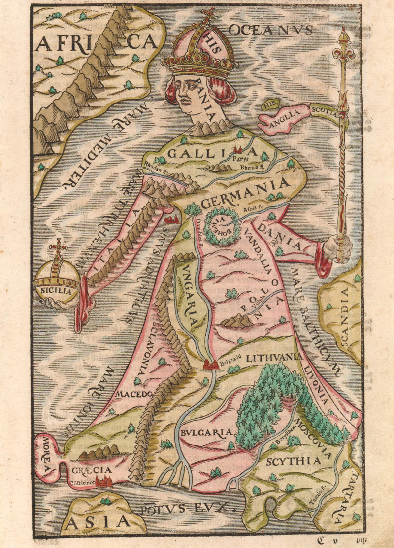
Sebastian Münster’s version of the Europa Regina (1588)
By contrast, the Europa regina is ostensibly a much simpler symbol to interpret. The idea of representing Europe as a queen originated in 1537 with a woodblock by Johannes Bucius, a Tyrolean courtier and humanist who served as secretary to Ferdinand I, then the Archduke of Austria. At the time of the map’s creation, Ferdinand’s brother, Charles V, reigned as head of the House of Habsburg, the Holy Roman Emperor, the King of Spain and Italy, and the Duke of Burgundy. Bucius’ map reflects his proximity to Habsburg power. It depicts “Hispania” (the Iberian Peninsula) as the Carolingian crown of the queen, the Alps as the neckline of her dress, the Kingdom of Bohemia as her heart, Denmark and Italy as her arms, and the eastern extent of the continent as her skirt. In her left hand, she holds a scepter, and, in her right hand, Sicily is her orb. As Ashley Bayton-Williams points out in his analysis of the Heinrich Bünting version of Europa regina, the placement of the crown is a crucial detail: “Spain was the source of his [Charles V’s] unprecedented wealth and power.” Despite the turmoil on the continent in the wake of the Reformation, the map presents an optimistic vision of Europe unified under Habsburg control. Or at least that is one interpretation. In her 1999 article “The Female Landscape,” Darby Lewes offers an alternate feminist reading of the symbol, referring to Bucius’ queen as “passive” and “quiescent.”
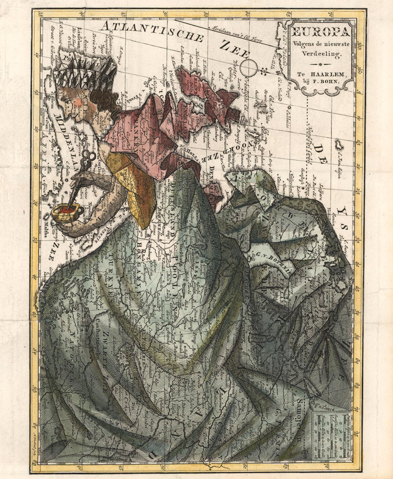
A subversive take on Europa regina: Europa Volgens de Nieuwste Verdeeling by Francois Bohn (1794)
Bucius’ personification of Europe as queen was popularized by derivatives published by Sebastian Münster (1580), Heinrich Bünting (1581), and Matthias Quad (1587). The metaphor of queen as geography proved resilient and adaptable. In 1761, two centuries after Bucius’ royal Europa, the Manila-based Jesuit priest Vicente de Memije published Aspecto Symbolico del Mundo Hispanico…, which transformed the vast expanse of the Spanish Empire into a queen. It is an unambiguously triumphant image, with a putto passing a flaming sword to the lovely empress, a symbol that signifies that Spain’s conquests were ordained from the heavens. Francois Bohn published a subversive twist on the Europa regina motif in the late 18th century with his Europa Volgens de Nieuwste Verdeeling (1794). The map, which was published in a satirical travelogue, ridicules Europa, reducing the continent from a proud queen to a hunched and rumpled housewife. Instead of a crown, Bohn’s Europa wears a drab bonnet; her scepter and orb have been switched out for the domestic implements of shears and a cup.
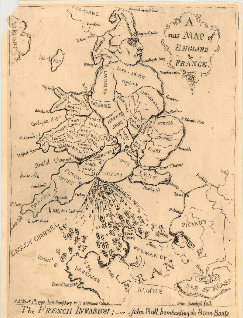
Henry George Bohn's reissue of James Gillray's A New Map of England & France / The French Invasion; - or - John Bull, Bombarding the Bum-Boats (1793/ca. 1851)
Anthropomorphic maps are often satirical in nature, depicting countries in crude caricatures that play on national stereotypes, skewer status, and/or comment on world events. One especially salient (and vulgar) example, originally published a year before Bohn’s humbled Europa, is James Gillray’s A New Map of England & France / The French Invasion; - or - John Bull, Bombarding the Bum-Boats. Tensions were high between England and France when the map appeared in 1793, with the threat of a potential French naval invasion looming large in the minds of the English populace. Gillray’s map vents the national resentment towards the French with a very special kind of cathartic release. He shows England as John Bull, the classic embodiment of the nation, here made to resemble George III in a nightcap (Northumberland) and tails (Wales). John Bull is in a squat, “bombarding the Bum-Boats” by vacating his bowels onto the French barges in the Channel. France is also personified, drawn in a rudimentary style as a decidedly displeased face. Is it any wonder why Gillray signed the map with a pseudonym?
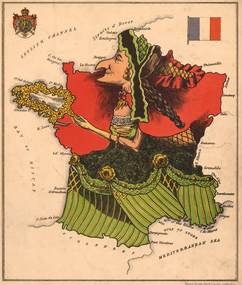
“Empress of cooks, of fashions, and the dance:” Lilian Lancaster’s anthropomorphic map of France (1868)
The caricatures in Aleph’s Geographical Fun: Being Humorous Outlines of Various Countries… (1868) are much gentler, which is fitting, since the book was primarily intended to amuse and educate the children of the Victorian era. The book features twelve chromolithographs by Lilian Lancaster that portray the political geography of Europe in caricature form, with pithy verses below that comment on the national character. England appears in the classic guise of the beautiful warrior Britannia; Prussia is Wilhelm I, King of Prussia, kneeling behind his prime minister Otto von Bismarck; Spain is a veiled woman (perhaps Isabella II) offering a bunch of grapes to Portugal the bear. According to the introduction by Aleph (the pseudonym of Dr. William Harvey), the maps were meant to instill in young minds “a healthful taste for an acquaintance with foreign lands.” But beyond Harvey’s stated intention to instruct, the maps have a not-so-subtle satirical bite. The map of France is emblematic. (Its design also echoes Bohn’s Europa Volgens de Nieuwste Verdeeling.) The country is an elderly, “hook-nosed lady” with a mirror in hand, an “empress of cooks, of fashions, and the dance.” The poem beneath the map closes with this couplet: “Her flatt'ring glass declares that vict'ry, power, / Beauty, wealth, arts, are her imperial dower.” Perhaps the image of France as a somewhat grotesque old lady helped English schoolchildren to learn their geography, but more importantly, the image would have left them with the impression of a vain, decrepit nation that is overly proud of its cultural achievements.
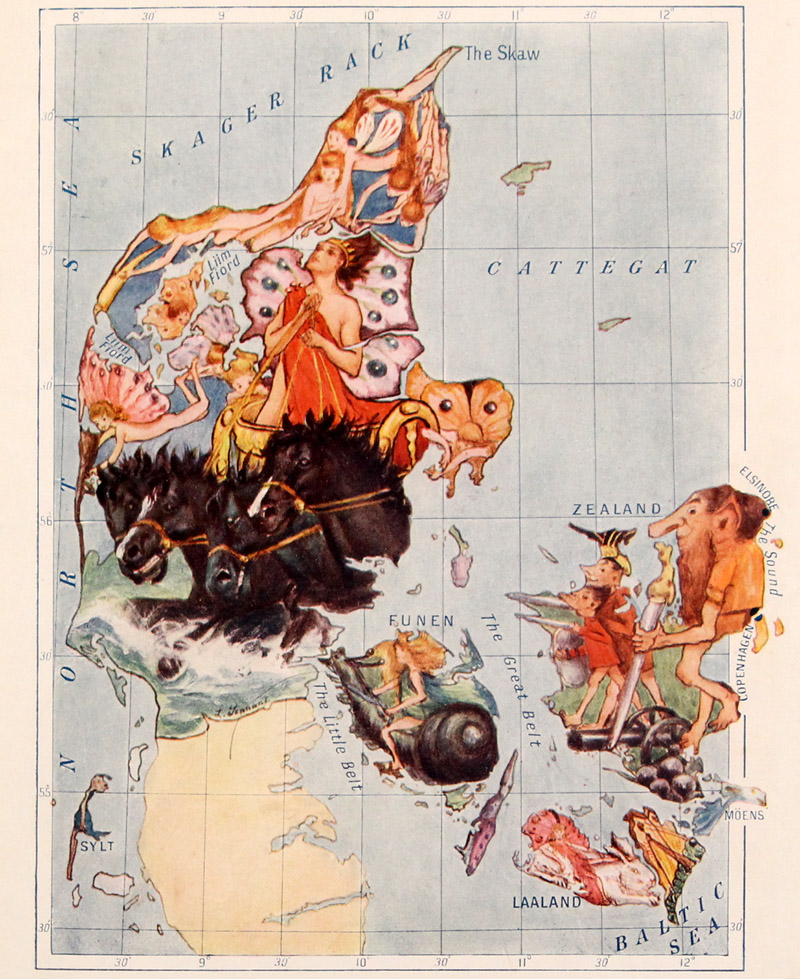
A later Lancaster map of Denmark, from Hoskyn’s Stories of Old (1912)
The illustrations in Geographical Fun were the brainchild of Eliza Jane Lancaster (1852-1939), better known as Lilian Lancaster, who supposedly conceived of the maps when she was only fifteen years old in order to distract her sick younger brother. From her early start in cartographic caricatures, she went on to a stunningly varied career as a stage actress, pantomime artist, and singer. She continued to produce anthropomorphic maps throughout her life, including a pair of satirical maps of the United States made as she toured America during the election of 1880 and a dozen works to accompany Elizabeth Hoskyn’s Stories of Old (1912), an illustrated compendium of medieval lore for children. In his excellent The Curious Map Book, Baynton-Williams describes Lancaster as “perhaps the most famous exponent of caricature maps.”
A face you’ll never forget: William Stokes’ Capital Mnemonical Globe (ca. 1868)
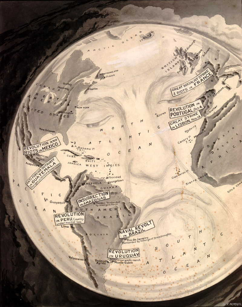
Harvey and Lancaster’s contemporary, William Stokes, also sought to teach geography to Victorian students, but his approach sanded off the winking edge of Geographical Fun’s caricature maps. Stokes’ folding Capital Mnemonical Globe (ca. 1868) turns the world into a human head with eyes in the North Atlantic and Africa, ears in the Pacific and Indian oceans, and a mouth in the South Atlantic. A self-proclaimed “teacher of memory,” Stokes believed that the geography of the world was easier to remember when it corresponded to the familiar form of the human face. Its effectiveness as a mnemonic teaching tool may be questionable, but Stokes’ serene, smiling paper globe certainly lives on in the memory as a strange and singular work of cartographic art. A darker, more political, take on the world-with-a-face motif can be found in British illustrator George F. Morrell’s untitled world map, published circa 1910, in which the world wears an anguished expression as it witnesses the upheavals of the early 20th century.
George F. Morrell’s despairing world (ca. 1910)
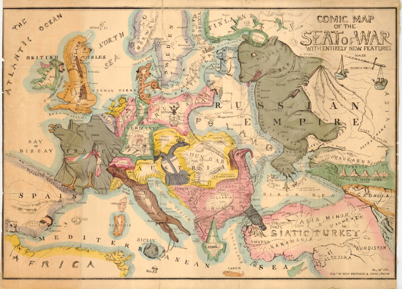
The most vibrant and creatively fertile cycle of anthropomorphic mapping kicked off in 1854 with Thomas Onwhyn’s Comic Map of the Sear of War with Entirely New Features. Onwhyn’s map dramatizes the political situation in Europe at the start of the Crimean War with a menagerie of bold caricatures. It popularized the template for a sub-genre of satirical maps referred to as “serio-comic” maps. These maps typically center on Europe and use a combination of anthropomorphic and zoomorphic caricatures to reflect the momentous political and cultural changes of the late 19th and early 20th centuries. Most of Onwhyn’s caricatures are animals, but other “serio-comic” maps rely more on human forms, usually incorporating images of political leaders and/or popular stereotypes.
Thomas Onwhyn’s Comic Map of the Seat of War with Entirely New Features (1854), a landmark “serio-comic” map
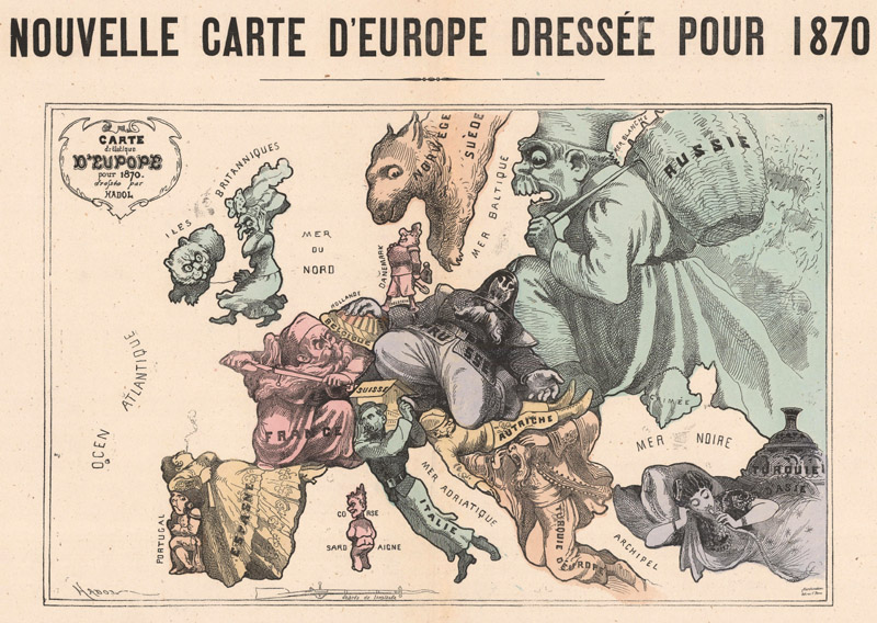
For instance, Paul Hadol’s Nouvelle Carte d'Europe Dressee pour 1870 presents Europe during the Franco-Prussian War (1870-71) as a clash of larger-than-life personifications. France is a fierce, bearded solider thwarting the advance of Prussia, once again embodied as stocky Otto van Bismarck, whose spiked helmet is pulled over his eyes. Great Britain is an angry old woman with a crooked nose (not too dissimilar from Lancaster’s version of France) and Ireland, a small bear on a leash. Russia eyes the scene as a hybrid bogey-man and beggar, attempting to fill his basket with whatever he can while Prussia focuses on the conflict to its west. Turkey in Asia is typecast as an opium smoker, withdrawn and passive in a drug-induced haze.
Embodying the Franco-Prussian War: Paul Hadol’s Nouvelle Carte d'Europe Dressee pour 1870
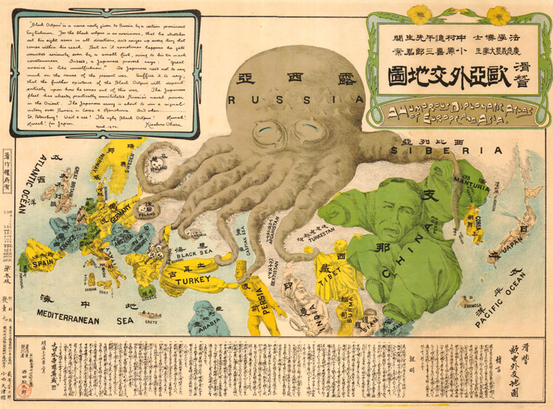
Most of the “serio-comic” maps confined their coverage to Europe, but Kisaburo Ohara’s A Humorous Diplomatic Atlas of Europe and Asia (1904) extends to include Asia as well. The map’s subject is the Russo-Japanese War (1904-05). Ohara, a student at Tokyo’s Keio University, modeled his work after a couple of “serio-comic” maps by Fred W. Rose that depicted Russia as a menacing octopus. Japan is personified as a soldier standing upon a cannon, firing a modest gun, and waving the Japanese flag. The contrast in size highlights Japan’s underdog status. Finland, Poland, Crimea, and the Balkans are all human skulls crushed in the grip of Russia’s tentacles. Turkey is a figure in traditional local dress who looks as if he is about to be torn in two by the “Black Octopus.” Persia is a strangled man. Tibet is a monk being extracted from the shadow of China, shown here squirming in discomfort at the tentacle around his shoulder. England, France, and Germany all strike martial poses with cannons aimed, but all three nations were constrained by treaties and alliances from directly participating in the conflict.
Kisaburo Ohara’s A Humorous Diplomatic Atlas of Europe and Asia (1904), a Japanese example of “serio-comic” caricature maps. [An example of this map will be offered in the January 26, 2022 auction.]
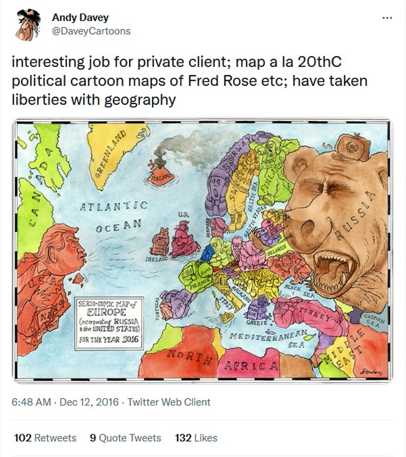
While other types of mapmaking have fallen by the wayside in the modern era, the tradition of anthropomorphic mapping continues to this day. In 2016 and 2018, Andy Davey, a political cartoonist based in the UK, drew two new “serio-comic” maps spoofing the contemporary political madness of Europe, specifically citing Fred W. Rose as his inspiration. The German artist Max Schörm regularly posts on his Instagram caricature maps in the tradition of Lilian Lancaster. Recent works include Texas as a waiter, Istanbul as Bart Simpson, and Iceland as Santa and his reindeer. Dallas-based artist Matthew Cusick offers a new twist on anthropomorphic mapping. His collages reconfigure maps and other printed ephemera to construct astonishing portraits that display the inextricable link between people and the geography they inhabit.
Andy Davey's Serio-Comic Map of Europe (incorporating Russia & the United States) for the Year 2016, posted on Twitter
It is easy to see why anthropomorphic cartography remains such a vital and enduring art form. Sure, anthropomorphic maps are often eye-catching and amusing, but their durability goes deeper than their surface pleasures. If maps are mankind’s attempt to make the world around us more legible, than it makes sense that we would connect geography to the form most familiar to us: our own bodies. Whether we are trying to remember which state is which or to understand geopolitical conflict, projecting humanity onto the landscape helps us to orient ourselves in the world. The artist Carmela Venti, herself a modern practitioner of anthropomorphic mapping, perhaps puts it best in her article “Maps, Metaphor, and Memory”:
"This overlapping of geography and human anatomy occurs because it is easy to see the human body and the configuration of land as metaphors for each other. A highway system is comparable to an arterial system. Mouths describe a feature of both rivers and digestive systems. Cities, like humans, have hearts. Oceans have tongues spanning from the ocean floor to the shallows of the shore. Because humans engage in metaphorical thinking, people can easily see Cape Cod, Massachusetts, as an arm in a flexed position."
References:
Baynton-William, Ashley, The Curious Map Book, The University of Chicago Press, Chicago, 2015.
Hill, Gillian, Cartographical Curiosities, The British Library, London, 1984.
Lewes, Darby, “The Female Landscape,” Mercator’s World Volume 2, Number 4, January/February 1999.
Slowther, Catherine, “Compass Points,” The Map Collector Issue No. 16, September 1981.
Venti, Carmela, “Maps, Metaphor, and Memory – Anthropomorphic Cartography,” Mercator’s World Volume 2, Number 4, July/August 1997.
Whittington, Karl Peter. (2010) The Body-Worlds of Opicinus de Canastris, Artist and Visionary (1296 – ca. 1354). [Doctoral dissertation, University of California, Berkeley]. https://escholarship.org/uc/item/2jc7h850