People tend to trust maps as if they were accurate and objective pictures of the world rather than interpretations of it. Of course, even the most basic and straightforward maps have subjective elements such as type of projection, color, and emphasis on specific features that influence the perspective of the viewer. But there is a subcategory of cartography called persuasive (or suggestive, or rhetorical) cartography where that manipulation of perspective takes precedence over strict fidelity to the facts of geography. The primary goal of these maps -- sometimes called "propaganda maps" -- is to convey a message to the viewer, to sway him to a certain point-of-view. The effectiveness of these persuasive maps comes in part from people's inherent confidence in the veracity of maps. They can be subtle or glaringly obvious, factual or deceptive, virtuous or immoral (depending on one's personal beliefs). Allegorical maps of Hell, a satirical anti-Napoleon broadside where the leader's coat appears as a battleground map of Germany, a bird's-eye view of New York City doubling as a shoe advertisement, a parrot-shaped map of Central and South America touting the achievements of Latin American writers: all of these fall under the umbrella of persuasive cartography, and all can be seen as a part of Persuasive Cartography: The PJ Mode Collection, an illuminating new online exhibition hosted by Cornell University Library's Division of Rare and Manuscript Collections. Launched this past August, the collection includes a wide variety of these persuasive maps, complete with high-resolution images and descriptive text that provides all-important context for each one.
The website features 300 maps so far, with hundreds more to come in the near future. With material spanning from the late 15th to the early 21st century, this unique collection spotlights a vast range of causes and agendas -- political, moral, social, etc. -- pushed by persuasive cartographers throughout history, as well as the strategies of persuasion they employ. According to PJ Mode, the donor of the collection, those strategies include "allegorical, satirical and pictorial mapping; selective inclusion or exclusion; unusual use of projections, color, graphics and text; and intentional deception." These persuasive techniques are the common denominators of the diverse assortment of maps on display; even as the messages vary or even directly oppose one another, the methods of delivery are comparable. It is a testament to the acuity of Mode's eye as a collector that a collection with such breadth feels so unified.
Mode, an alumni of Cornell's engineering program, retired in 2013 after a distinguished career in law that included a stint as chief counsel of the United States Senate Subcommittee on Constitutional Amendments from 1970-73, a partnership and eventual chairmanship at the Washington, D.C. law firm Wilmer, Cutler, and Pickering, and a decade as special counsel to Citigroup. He began collecting maps soon after visiting an exhibit called "Carte et Figures de la Terre" in Paris in 1980. At first, Mode focused on acquiring maps of the world and Western Hemisphere, purchasing every now and then a novel cartographic curiosity. But as it so often happens with collectors, what began as a tangent to the collection eventually became the meat of it. Mode realized that what these disparate cartographic curiosities had in common was their aim to convince, to argue, to get a message across to the viewer. Inspired in part by two visits to Denis Wood's "The Power of Maps" exhibition in the early 90s and his own work in law, where visual aids often play a crucial role in communicating ideas and proving a point, Mode focused his collecting and research on persuasive cartography, especially over the past six to eight years. In that time his collection has ballooned to more than 700 items.
Although less than half of the collection is currently up on Cornell University Library's Division of Rare and Manuscript Collections website, there are plans to eventually add the remainder. Both Mode and his wife, Elaine, are from Cornell's Class of 1960, which played a role in his choice to donate his collection to the Division of Rare and Manuscript Collections. But the major factor was the fact that the maps would be digitized, available to the public, and free to download. The entire collection can be accessed by anyone with an internet connection: scholars, cartophiles, dilettantes, and casually curious web surfers alike. With its high resolution images, informative collector's notes, and fascinating write-ups on the background of the collection and persuasive cartography in general, the website serves as both a great jumping-off point and a singular, in-depth resource for a subject that has been largely neglected by scholars until fairly recently. Cornell University Library has shown great dedication to the Persuasive Cartography collection, enhancing the browsing functionality with an upgrade to the website over the holidays and pledging to continue adding to the collection as new material is catalogued.
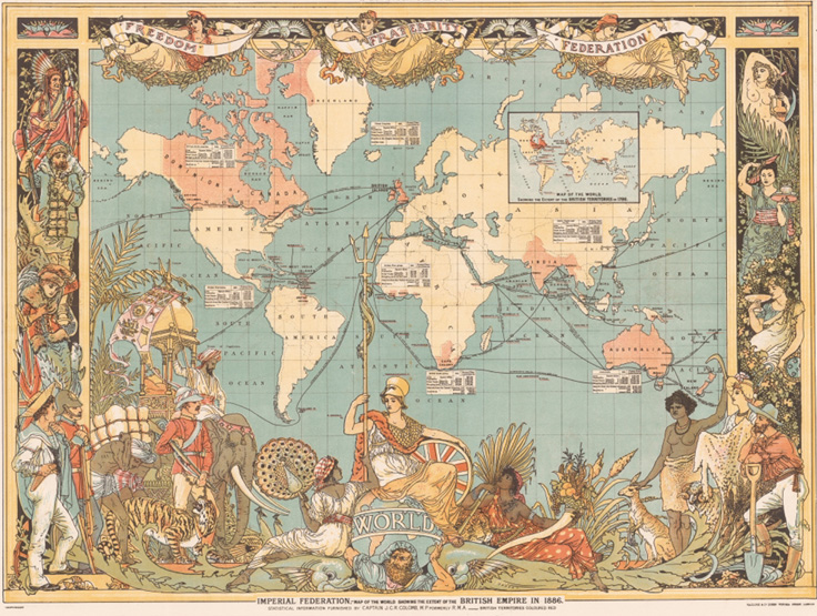
When asked about his favorite items in the collection, Mode protests, "That's like asking me to identify my favorite grandchild!" He then complied with a rich and diverse list of items. At the top of it was Walter Crane's Imperial Federation Map of the World Showing the Extent of the British Empire in 1886, which Mode calls "maybe my most favorite, at least today." A lavishly decorated map published on the eve of Queen Victoria's Golden Jubilee, it ostensibly celebrates the glory of the British Empire, highlighting the vitality of the Empire's international trade and its impressive geographic and cultural spread. The borders of the map are lined with people, plants, and animals from all over the world, the implication being that all of these creatures are subjects of the British Empire. But Crane, a socialist, complicates this surface imperialist message with symbols in line with his leftist politics: the figures of Freedom, Fraternity, and Federation wear red Phrygian caps, a common symbol of liberty, and Atlas, hoisting the world that Britannia is perched upon, wears a sash emblazoned with the words "Human Labour." It is an odd masterpiece of persuasive cartography wherein the cartographer subverts the primary message of the map.
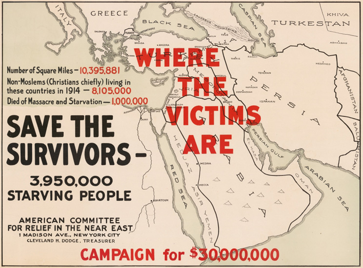
A more direct -- and timely -- favorite of Mode's is Save the Survivors, a 1918 poster from the American Committee for Relief in the Near East (an organization that still exists under the name Near East Foundation). In the aftermath of the Armenian Genocide and the Middle Eastern theatre of World War I, the committee sought to raise $30 million in relief funds for the region's refugees. This poster sums up the humanitarian crisis with concision and clarity and asks the public to contribute. The words "Where the Victims Are" appear in bold, blood red letters over a map of the Middle East, with a handful of dire statistics alongside, also in crimson. According to the map, there were nearly 4 million people starving in the region, with a million dead already from "massacre and starvation." The message here is unambiguous, urgent, and clearly delivered. By 1920, the committee had met and surpassed their fundraising goal.
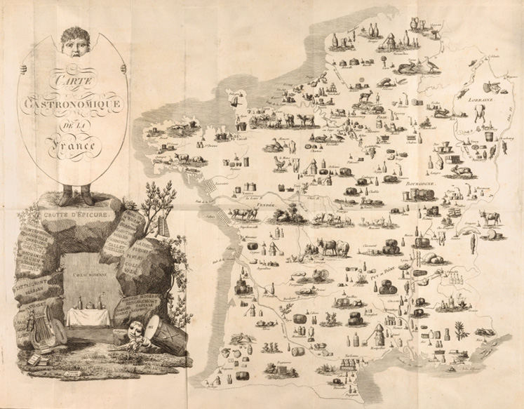
There is also a lighter side to the collection, persuasive maps that deal in subject matter significantly lighter than imperialism and genocide. Mode points to the charming Carte Gastronomique de France, published in 1809 by Charles Louis Cadet de Gassicourt in his Cours Gastronomique, a book on the science of food. Dedicated to La Societe Epicurienne du Caveau Moderne, a group of food, wine, and music enthusiasts, it is the earliest example of a "carte gastronomique," a type of map that emphasizes the food and drinks that define a region. Rather than topographic detail, the map depicts a France littered with barrels and bottles, fish and livestock. It literally presents food and wine as part of the landscape. In doing so, the map not only illustrates the scope and superiority of French cuisine, it also inextricably ties food and wine to the national identity.
These examples represent a mere sliver of Mode's substantial collection and demonstrate just a few of the visual-rhetorical techniques used by persuasive cartographers to spread their messages. There is a wealth of material to be found in this exhibition: T-O maps with Jerusalem at the center of the world, allegorical maps to help navigate affairs of the heart, maps from the temperance and woman's suffrage movements, World War maps, pro- and anti-Communist maps, even a map promoting James Bond. A totally comprehensive look at persuasive cartography may be impossible, but Mode and Cornell University Library's Division of Rare and Manuscript Collections have made a valiant effort -- and there are still hundreds more maps left to be added. Taken as a whole, Mode's collection is more than a thorough overview of persuasive maps -- it is a valuable lesson in the ways in which visual media can be used to mold and shift the perceptions and beliefs of the viewer.
Click here to access the Persuasive Cartography collection.